%20(2).png?width=347&height=50&name=Ghetto%20Logo%20%20(500%20x%20317%20px)%20(2).png "Ghetto Logo (500 x 317 px) (2)")
If you’ve ever been frustrated at PowerPoint for only giving you access to blue, orange, gray, yellow, and green when you want to create, you’re doing something incorrectly.
If you’ve ever changed the color or font of your titles on each slide, it’s not PowerPoint, it’s you.
If you’ve ever had to scroll and scroll to find the font you used for the previous slide and then do the same on every slide, I can see why you don’t like PowerPoint. Spoiler alert: you’re doing it wrong.
When you open PowerPoint, you’re sitting in front of a white slide, using the Title Slide Layout. You find Aptos easy but boring curves there, staring back at you.
And even if Microsoft tried to revamp its basics, you get a color palette that loosely reminds you of your teenage years projects or the last gouache painting your toddler brought back from daycare. The one that stained their favorite shirt… and eyebrows. If you want this presentation to look nice, you’ll most likely want to change that.
How to get your presentation started properly
Colors
If you relate to any of the situations I’ve described earlier, it’s just because you’ve been starting your presentation without setting up the stage. First, you should tell PowerPoint what font and color variant to use. To do this, go to the Design tab, and find the Variant section.
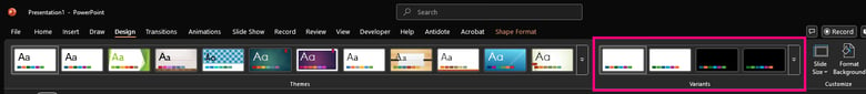
There, you’ll be able to choose and edit new variants, making your life much easier later on. If you work in an organization with strong brand guidelines, it’s a good idea to make variants that meet the brand style and save it for later use. Here’s how:
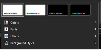
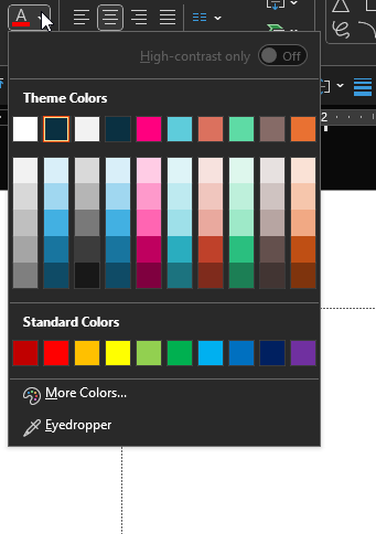
By default, the Variant section looks like the image above. To set the presentation’s colors, go to the Color section:
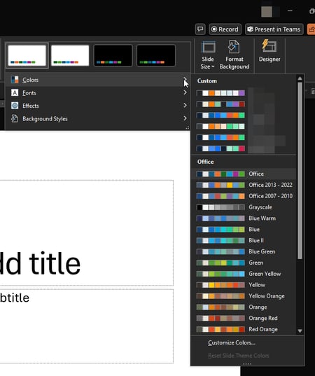
You’ll notice a “Custom Section” above the Office section. You probably won’t have any colors there right now. These are the PowerPoint color palettes I use the most often. Some are for personal projects, for work, or for clients. I create the palettes because it’s a “set it and forget it” approach. When you select one of these color variants, it replaces the toddler-gouache-painting palette used by default.
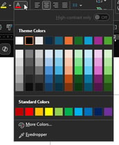
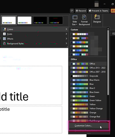
To create your own, you’ll need to scroll all the way down to Customize Colors…
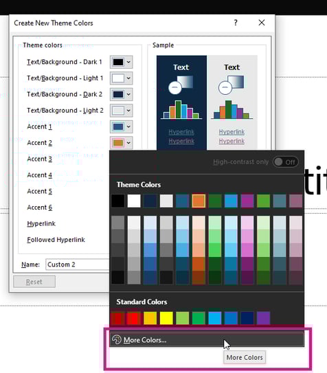
Before letting the colors flow, name your palette. Believe me, if you don’t do this now, you’ll forget and end up with Custom 1, Custom 2, …, and Custom 18, and you won’t remember what’s what.
Then, it’s all about adding what you need. If your branding team has set colors, you’ll need to use the More color… option to get the ones you need:
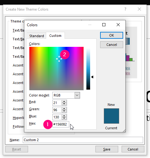
The easiest way of adding your colors is by hexadecimal code. Your brand guide will have the colors’ codes in it (if it doesn’t, it should. Complain to whoever made the brand guide. Tell them I sent you.) If you’re out of the corporate environment, then you can use the color picker, or build a palette online and use the hexa codes from there. Adobe has this excellent tool to help you create harmonious color palettes with just a few clicks. Play with Adobe color here: https://color.adobe.com/create/color-wheel
Once you’ve set the palette, you’ll notice that it replaced the default colors in every editor of the app for this presentation.

Fonts
You should see this coming, but it works exactly the same way for the fonts, but it’s even simpler. Here are my fonts. Notice the Custom and Office sections once again.
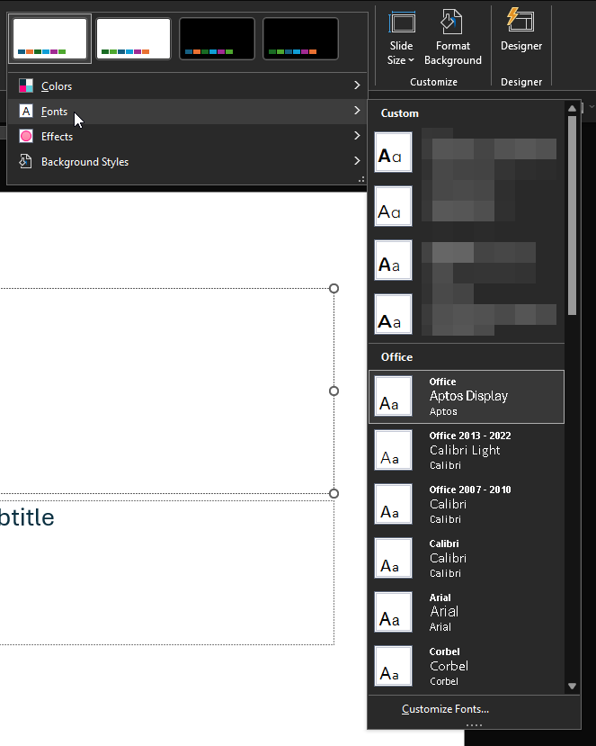
And the Customize Fonts… at the bottom:
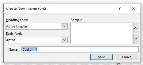

Name your new Theme Fonts. You get to select a font for your presentation’s headings and one for the body of text. That’s it. Everything else, like size, weight, alignment, line height, and colors is all handled through the Master Slide, which I’ll cover some other time. Select your font(s) and save your theme.
You should see the default slide adapt to the font you selected, You’ll also notice the font took Aptos very coveted spot as the top font in the app’s list:

Why use the Theme Variants, really?
I understand that if design is a second thought for you, you might think I’m being overzealous by changing the theme variant, but hear me out.
Let’s say you build your whole end-of-quarter presentation, and you’re ready. You’re on fire. That plan is THE plan. The execs will eat out of your hand, you feel it. You’ve built this PowerPoint presentation with your blood and sweat. Ok, maybe tears, too. 53 slides of pure genius. You’ve followed the brand guidelines to a T, even your artistic director would be proud.
Speaking of, they send you a quick chat on Teams and say :
“Hey bruh (ADs are cool, right? They’Re hip. I think they surf. or Skateboard.) I remember you have your big meetup today, thought I’d let you know that we’ve switched the font from Roboto to Oswald. They love it! k, ciao!”
Now, if you’ve followed my wise words and used PowerPoint as it’s intended to, you’ll have 1 place to make the switch: Theme Variants. Design tab > Theme Variant > Fonts > hover the one you want to edit, and right-click on it:
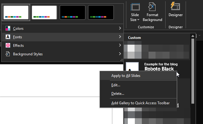
Hit Edit… and replace Roboto – or whatever font was there. Rejoice in your cleverness as you watch your 53 slides font change. Go grab an iced latte, you’ve earned it.
Oh, you didn’t use Theme Variants and decided to keep doing it your way? You must be a Taurus. It’s ok, you don’t mean to be stubborn. Have fun editing your 53 slides one by one, though! K, Ciaoooooo! *skateboards away swiftly with grace*